German carmakers and suppliers want to create a shared open-source platform. Reference architecture should be ready by 2025, with a production vehicle by 2030.
We once had to make an interface for a big German car manufacturers new car. It showed texts about things and stuff (I really don’t remember). The target was an embedded browser for which a not really accurate emulator existed.
I could only develop against that emulator. They could not supply us with a computer running the real thing. For testing I had to go to a secret locked garage where the real car stood with obfuscation decals so that competitors wouldn’t be able to see the design. It was really tight and uncomfortable to work in when I had to debug something only occuring on the real hardware. And I was lucky that I had cellphone reception at all in the garage.
One or two years later after I had left that team I saw a colleague finally having basically a full car’s cockpit in his office for testing, so things got a little bit better.
My point is, car companies work differently than computer guys. I hope this project won’t die amid their inflexibility.
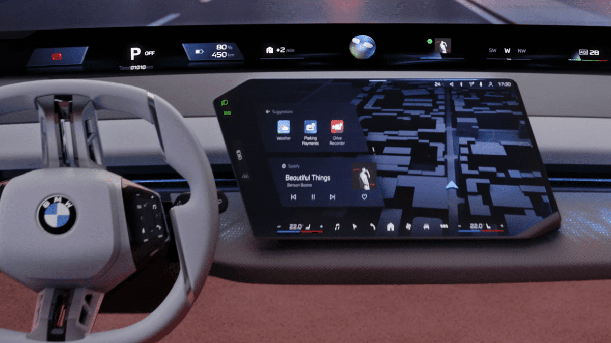
I’ve noticed some problems with how user interfaces are designed on cars. Especially google maps. Tiny hard to reach buttons with margins separating them. Sure, it looks sleeker, but when one is driving and cannot easily look at the screen, that’s the least of our concerns
This isn’t a “control the air conditioner with a touch screen” scenario. I’m actually specifically thinking of the tiny button to mute/unmute direction announcements
Yeah, the knob to control everything was a big reason why developing for the emulator sucked. With the emulator you could just click on buttons and links, where in the real thing the users would be stuck with an awkward knob they’d turn to select stuff.
I loved that ‘big awkward knob’ or the ‘idrive controller’ in the BMWs, now sadly it’s gone, so I take mine and everyone else’s life in my hands to zoom in or out on navigation, or to find a setting the car insists is default and I have to opt out of on every single journey.
Knob, reach down, without taking eyes off road, feel the position, click turn idents to know how many menu levels you’re in, push down to select.
You can’t feel a touchscreen to find button three of five, it literally forces you to look at it to operate. So unsafe!


We once had to make an interface for a big German car manufacturers new car. It showed texts about things and stuff (I really don’t remember). The target was an embedded browser for which a not really accurate emulator existed.
I could only develop against that emulator. They could not supply us with a computer running the real thing. For testing I had to go to a secret locked garage where the real car stood with obfuscation decals so that competitors wouldn’t be able to see the design. It was really tight and uncomfortable to work in when I had to debug something only occuring on the real hardware. And I was lucky that I had cellphone reception at all in the garage.
One or two years later after I had left that team I saw a colleague finally having basically a full car’s cockpit in his office for testing, so things got a little bit better.
My point is, car companies work differently than computer guys. I hope this project won’t die amid their inflexibility.
I’ve noticed some problems with how user interfaces are designed on cars. Especially google maps. Tiny hard to reach buttons with margins separating them. Sure, it looks sleeker, but when one is driving and cannot easily look at the screen, that’s the least of our concerns
Physical buttons will now be required in the EU, so hopefully that problem will be less.
My ID4 was horrible with that. Only oversensitive capacitive touch buttons and an extremely laggy touchscreen.
This isn’t a “control the air conditioner with a touch screen” scenario. I’m actually specifically thinking of the tiny button to mute/unmute direction announcements
Yeah, the knob to control everything was a big reason why developing for the emulator sucked. With the emulator you could just click on buttons and links, where in the real thing the users would be stuck with an awkward knob they’d turn to select stuff.
I loved that ‘big awkward knob’ or the ‘idrive controller’ in the BMWs, now sadly it’s gone, so I take mine and everyone else’s life in my hands to zoom in or out on navigation, or to find a setting the car insists is default and I have to opt out of on every single journey. Knob, reach down, without taking eyes off road, feel the position, click turn idents to know how many menu levels you’re in, push down to select. You can’t feel a touchscreen to find button three of five, it literally forces you to look at it to operate. So unsafe!